Custom components
It is common for UI elements such as inputs or cards to be repeated through a page. To make your UI code more reusable and maintainable, you can encapsulate complex UI elements as functions that can be used along the existing calls in Stipple.
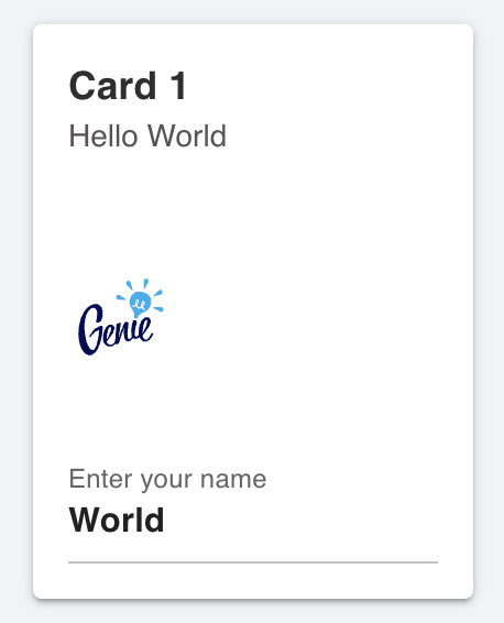
Let's say your app displays a card with a title, an avatar, and an input field:
using GenieFramework
@genietools

@app begin
    @in name = "World"
end

ui() = card(style="width:200px",
        [
        card_section([h4(title), p("Hello {{name}}")]),
        card_section(
                    avatar([
                            img(src="https://learn.genieframework.com/assets/logo.svg")
                            ])),
        card_section(textfield("Enter your name", :name))
        ])

@page("/", ui)

To make the card into a reusable component, create a mycard function as
using GenieFramework
@genietools

function mycard(title, namevar)
    card(style="width:200px",
         [
          card_section([h4(title), p("Hello {{$namevar}}")]),
          card_section(
                       avatar([
                               img(src="https://learn.genieframework.com/assets/logo.svg")
                              ])),
          card_section(textfield("Enter your name", namevar))
         ])
end
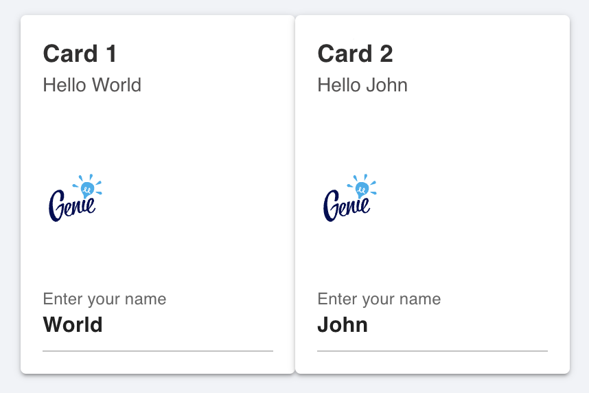
The mycard function takes as parameters the card title, and the symbol of the reactive variable holding the name. This way you can call mycard multiple times on different variables like this:
@app begin
    @in name1 = "World"
    @in name2 = "John"
end

ui() = row([mycard("Card 1", :name1), mycard("Card 2", :name2)])
@page("/", ui)
The UI code in your app.jl is now cleaner and you can modify all cards at once by editing the source components.

For more inspiration on building complex components, see the code for the datefield, timefield, and card_1 components in StippleUI.