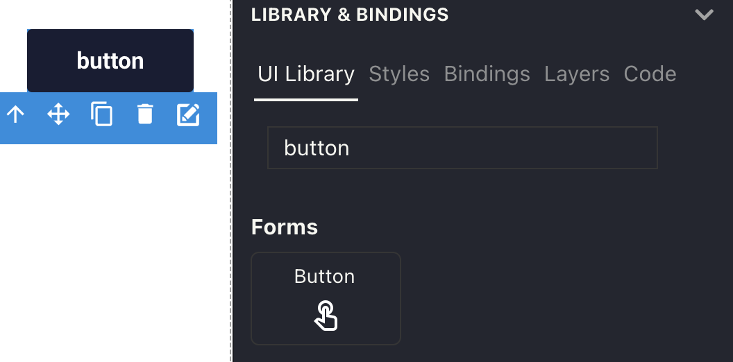
UI components
Genie Builder provides over 70 components and charts to build your UIs. Most of them are very easy to use, with many examples shown in the component gallery but some require a bit more configuration. This page explains how to use these advanced components; to see them used in an app see the Tutorial app.
File uploader
The file uploader component lets users upload files to the app.
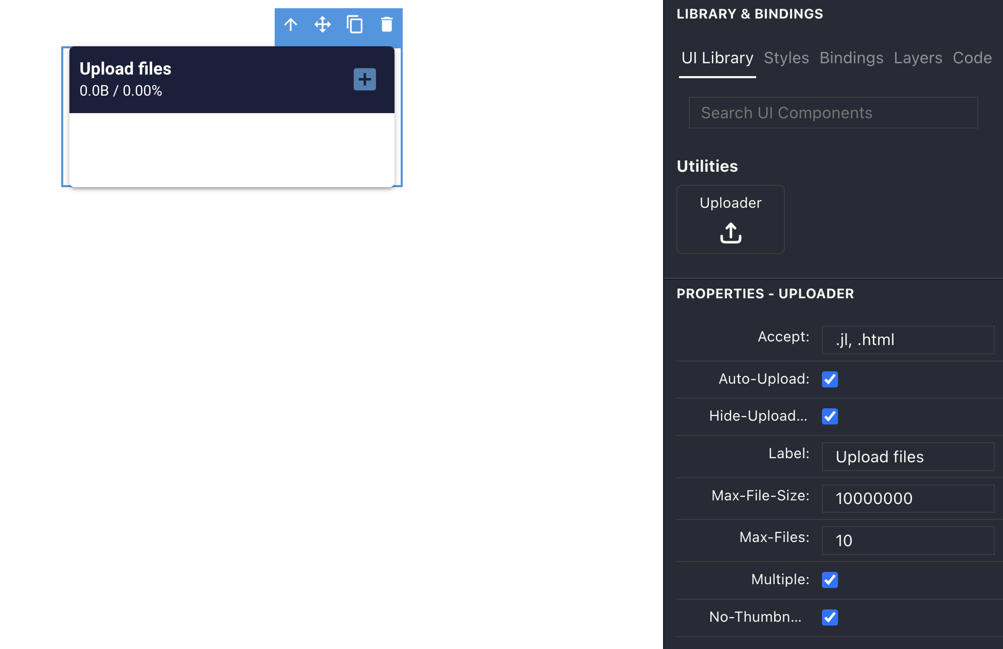
The Accept field takes the list of file extensions accepted by the uploader. For instance, you can set it to * to accept all extensions, or .png, .jpg, .svg to accept only images.
In the Julia code, you'll need a handler to manage the uploaded files:
module App
using GenieFramework
@genietools
const UPLOADS_FOLDER = "uploads"
@app begin
    @onchange fileuploads begin
        uploaded_file = UploadedFile(fileuploads)
        try
            cp(uploaded_file, UPLOADS_FOLDER; force = true)
        catch e
            @error "Error processing file: $e"
            @notify("Error processing file: $(uploaded_file.name)")
        end
    end
end
@page("/", "app.jl.html")
end
The fileuploads variable is predefined and contains the information about the uploaded file. Inside the handler, the file information is cast into an UploadedFile struct and then the file is copied to its destination folder. If multiple files are selected by the user, this handler will be triggered once for each file.
The uploader component emits events during the upload process. These can be intercepted with an event handler to perform additional processing, or send notifications to the UI as in this code:
    @event uploaded begin
        @info "File uploaded"
    end
    @event rejected begin
        @info "rejected"
        @notify("File rejected")
    end
    @event finished begin
        @info "Upload finished"
    end
    @event failed begin
        @info "Upload failed"
        @notify("File upload failed. Please try again.")
    end
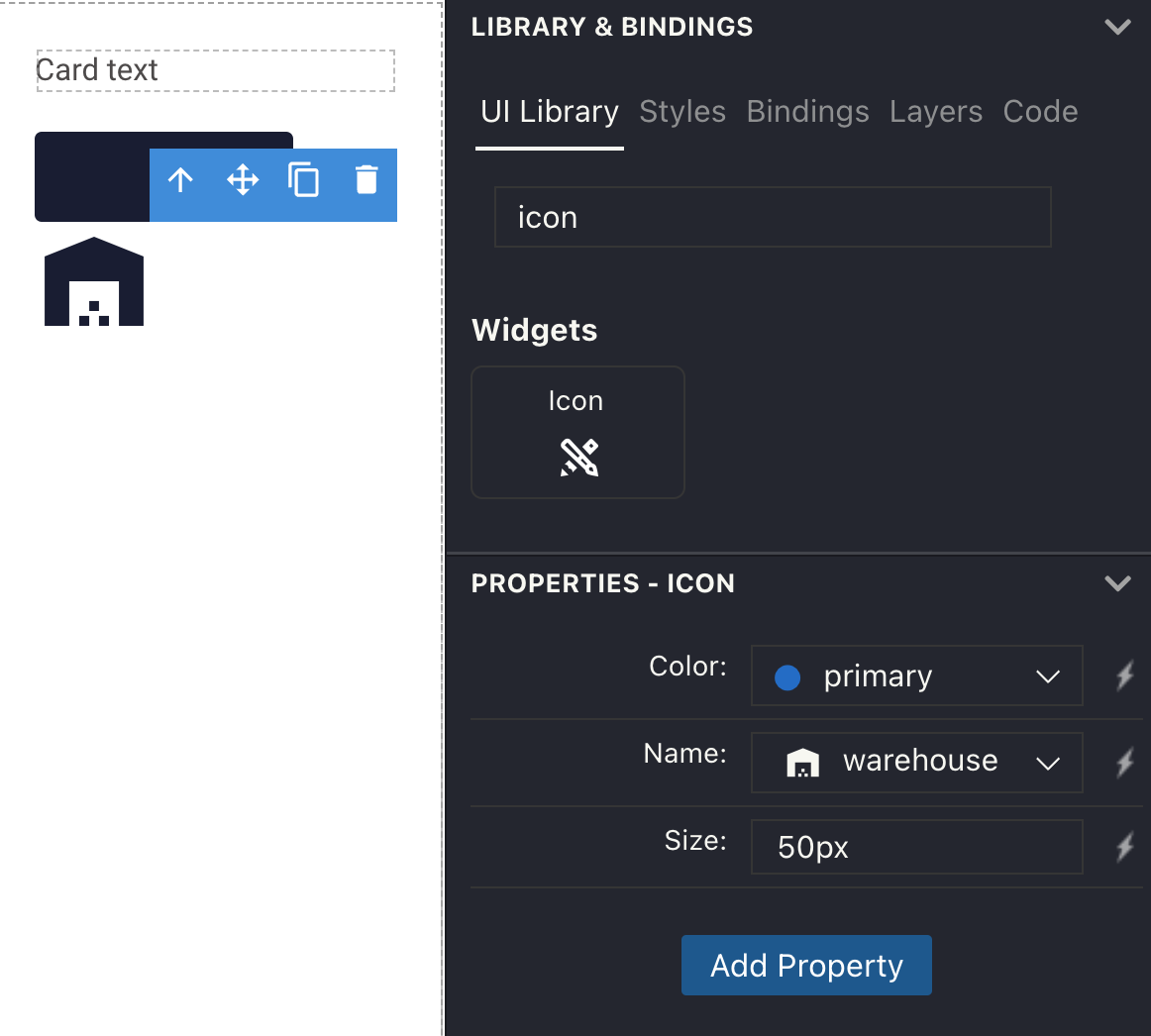
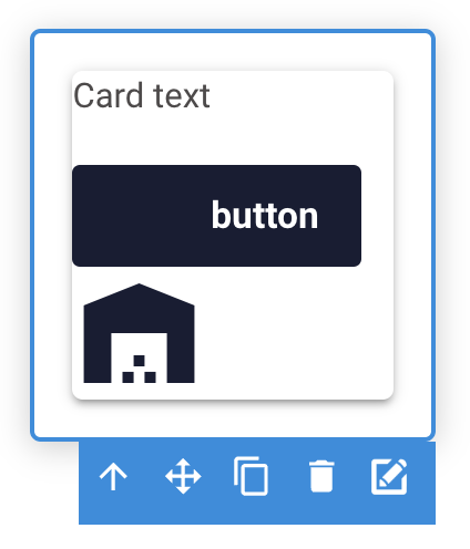
Nestable components
Some components like card, scroll area or tab panel behave like containers with other components inside them. In the visual editor, you cannot drag and drop components inside these containers like you would with the row or column elements. Instead, you need to drill down into the component and add the desired content.
To drill down into a nestable component, click on the pencil icon in the corner of the component.
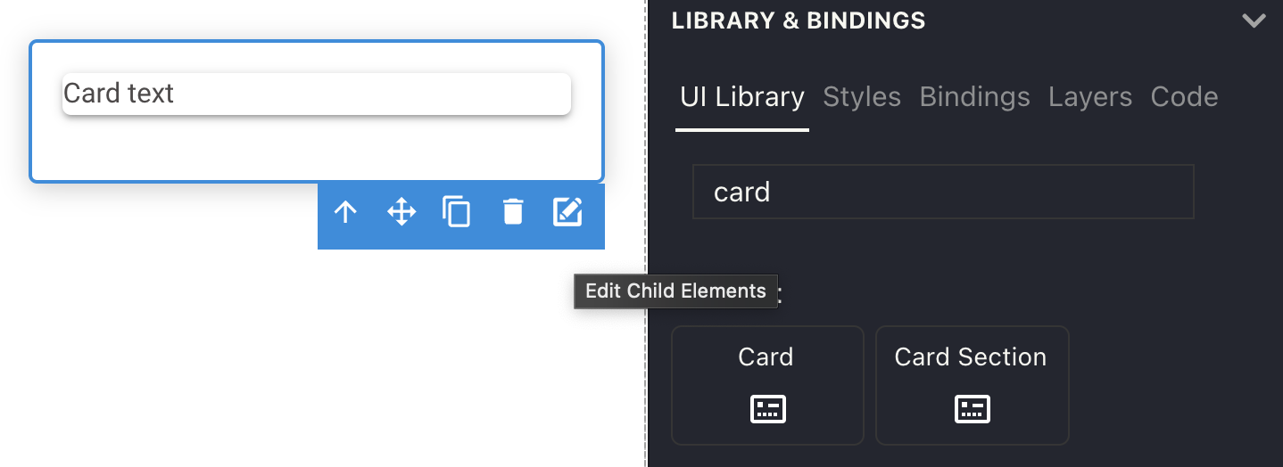
A new tab will open. Here, you can drag and drop new components as if you were on the main canvas.
When the content is saved, it will be displayed inside the nestable component on the main canvas tab.
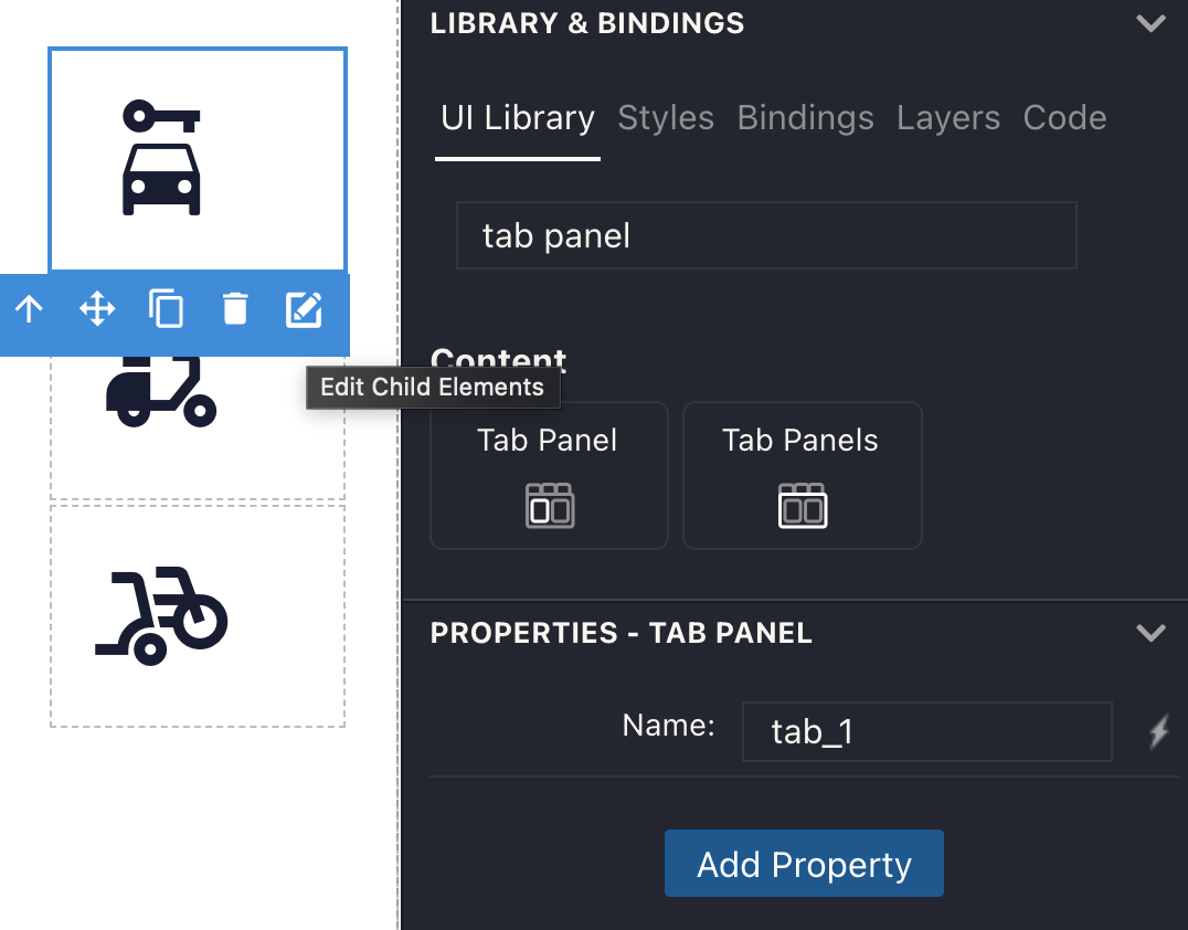
Tabs
Tabs allow you to display content using less space, by letting you to instantly switch between tabbed pages.
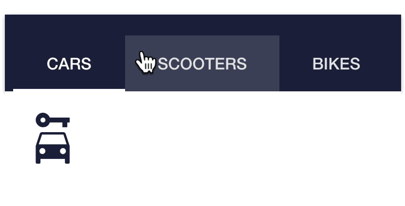
To use tabs in your app, you'll need to configure three elements:
1. The tab menu that displays the tab names and lets the user switch between them.
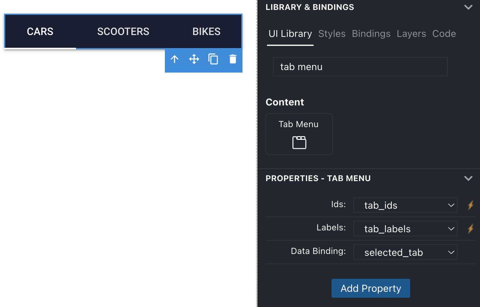
This component takes three parameters: the id of each tab, the label of each tab, and the data binding that will store the id of the selected tab. For example, these are the variables used in the screenshot above:
@out tab_ids =  ["tab_1", "tab_2", "tab_3"]
@out tab_labels = ["Cars", "Scooters", "Bikes"]
@in selected_tab =  "tab_1"
2. The tab panels container that holds all the tab panels.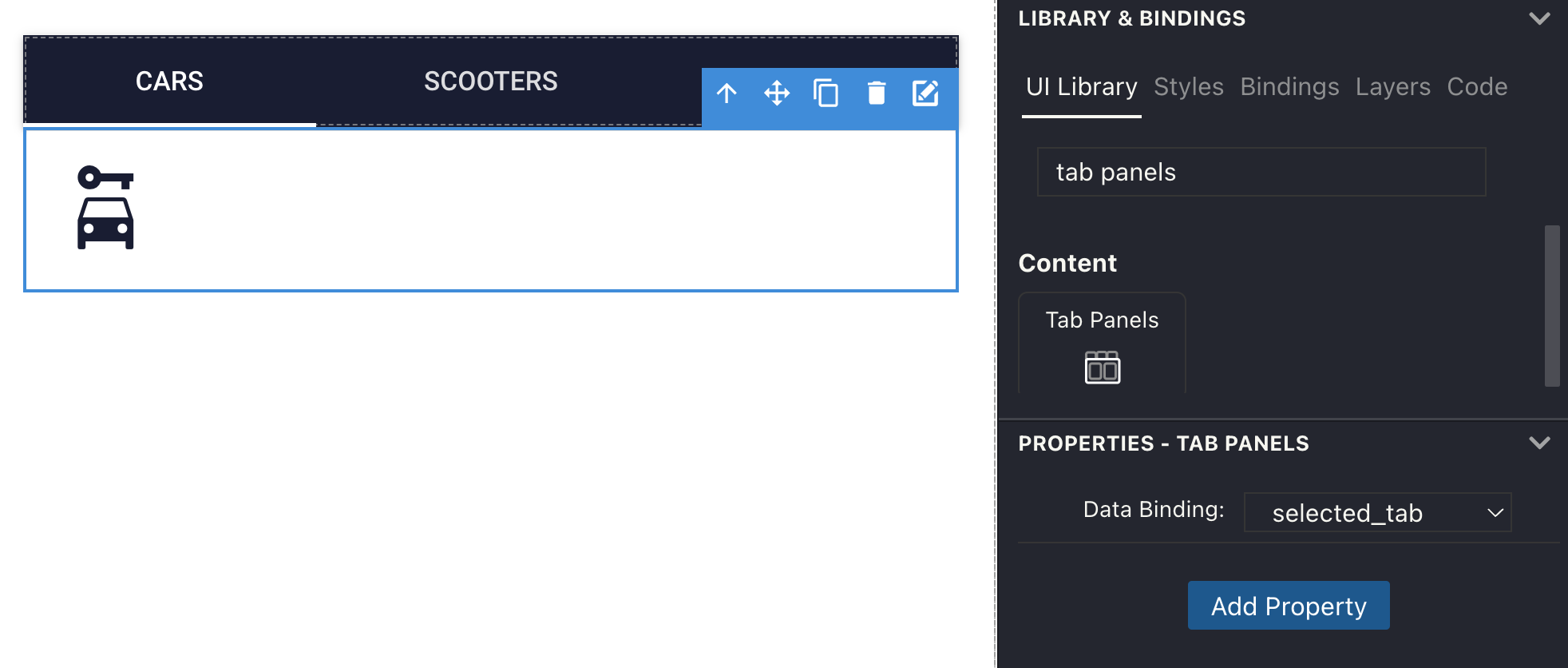
This component also needs a data binding to store the id of the selected tab, which must be the same as the one set earlier in the tab menu.
3. Each individual tab panel that holds the content for each tab.
You'll need to add a number of tab panels equal to the number of panel ids in the tab menu, and set the Name field of each equal to the id from the tab menu. Then, edit the content of each tab by drilling into it.
Conditional
The conditional component is a container that can hide its contents based on a condition.
To use it, declare a boolean variable in the backend, and bind it to the conditional component on the canvas.
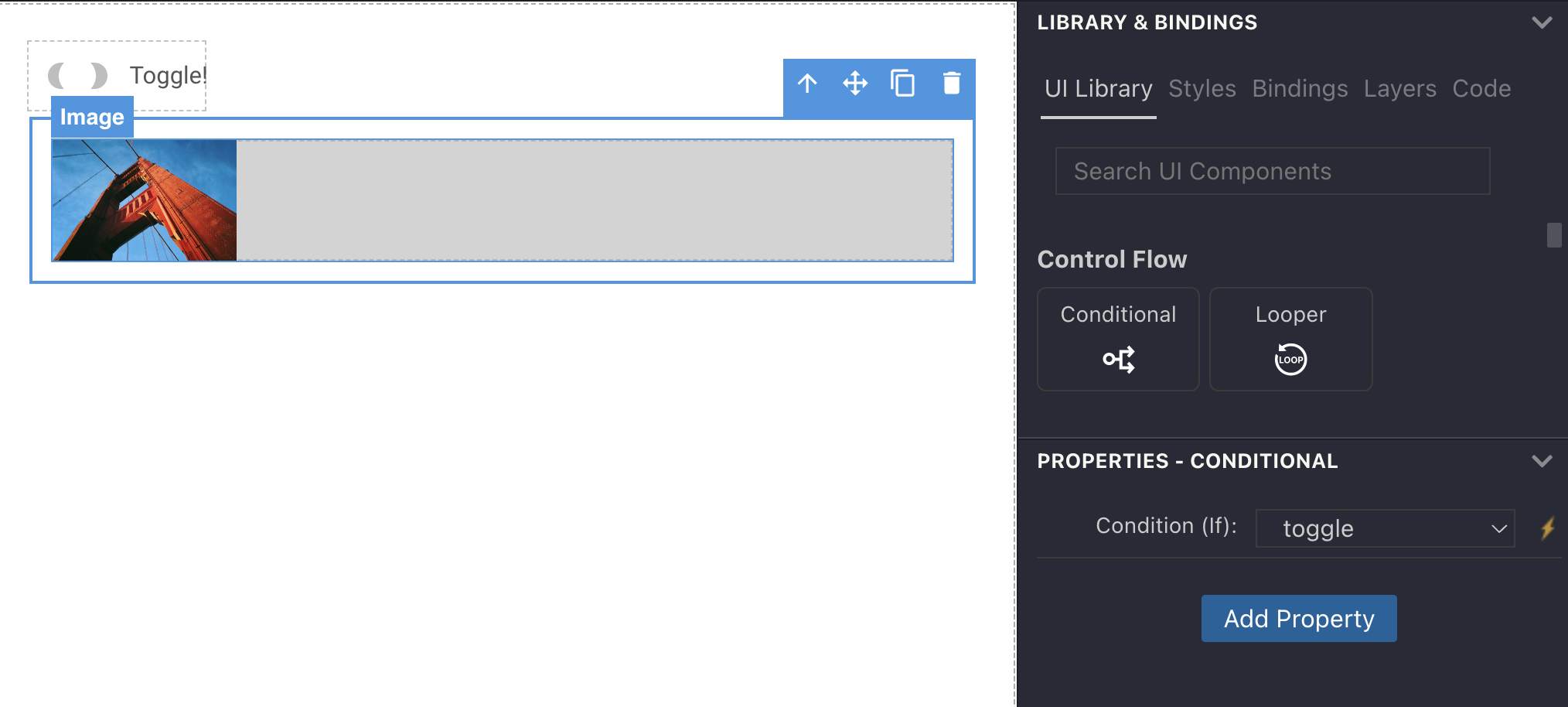
When the variable is false, the contents of the conditional component will be hidden as the animation below shows.

Looper
The looper component is used to loop over a list of items and render a component for each item.
To use it enter an expression in the Loop (For) field to iterate over a list of items. The expression must be of the form item in item_vector, where item_vector is either an array. You can also write the array in place as item in [item1, item2, item3] like in the example below.
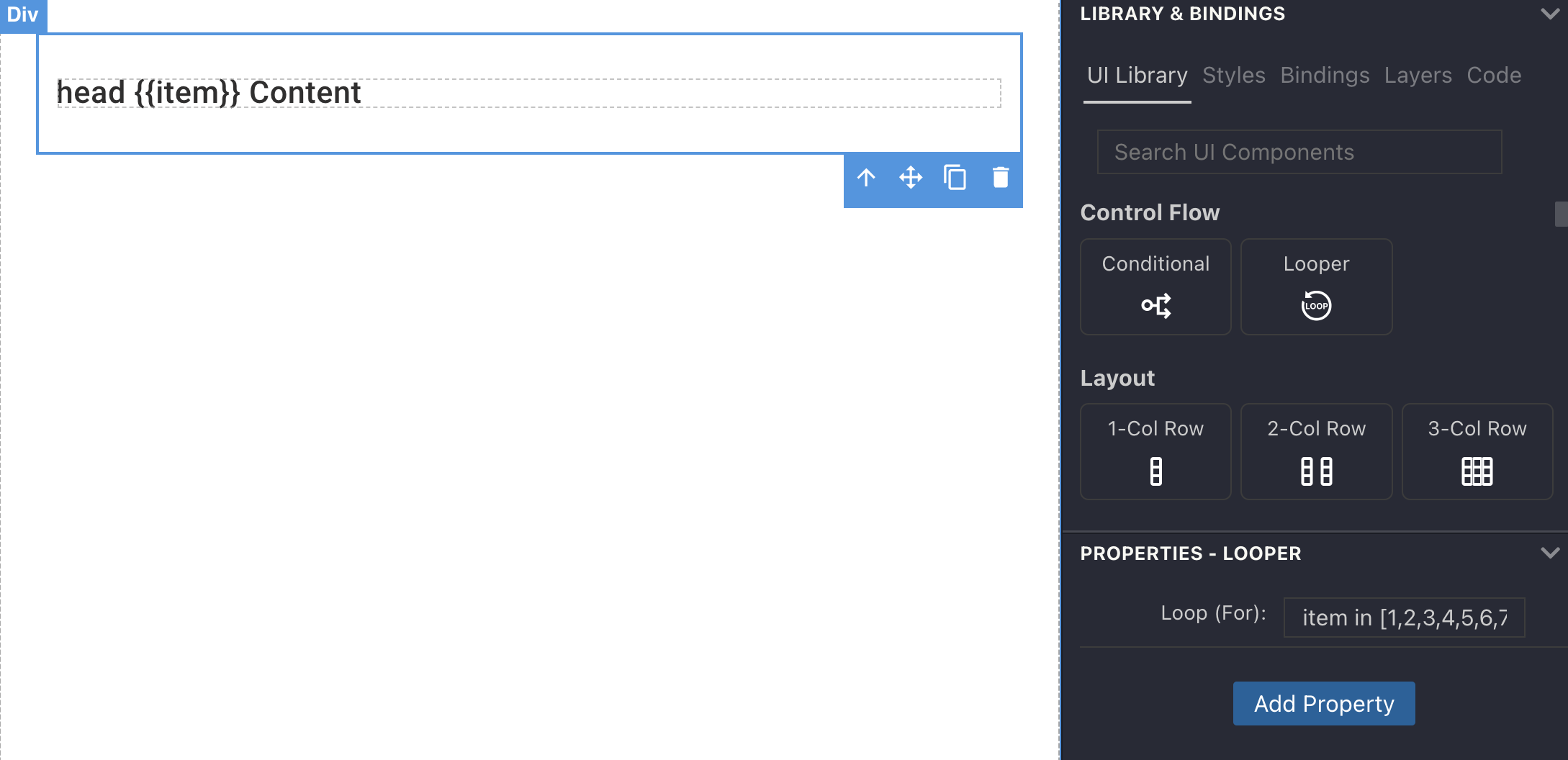
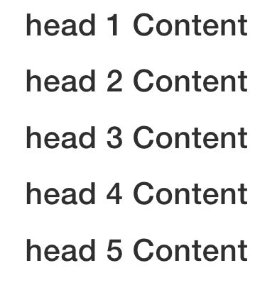
When previewed in the browser, this will show a list of headers:
StippleTable
This is a special table component implemented by the StippleTable.jl that brings server-side pagination and table search.
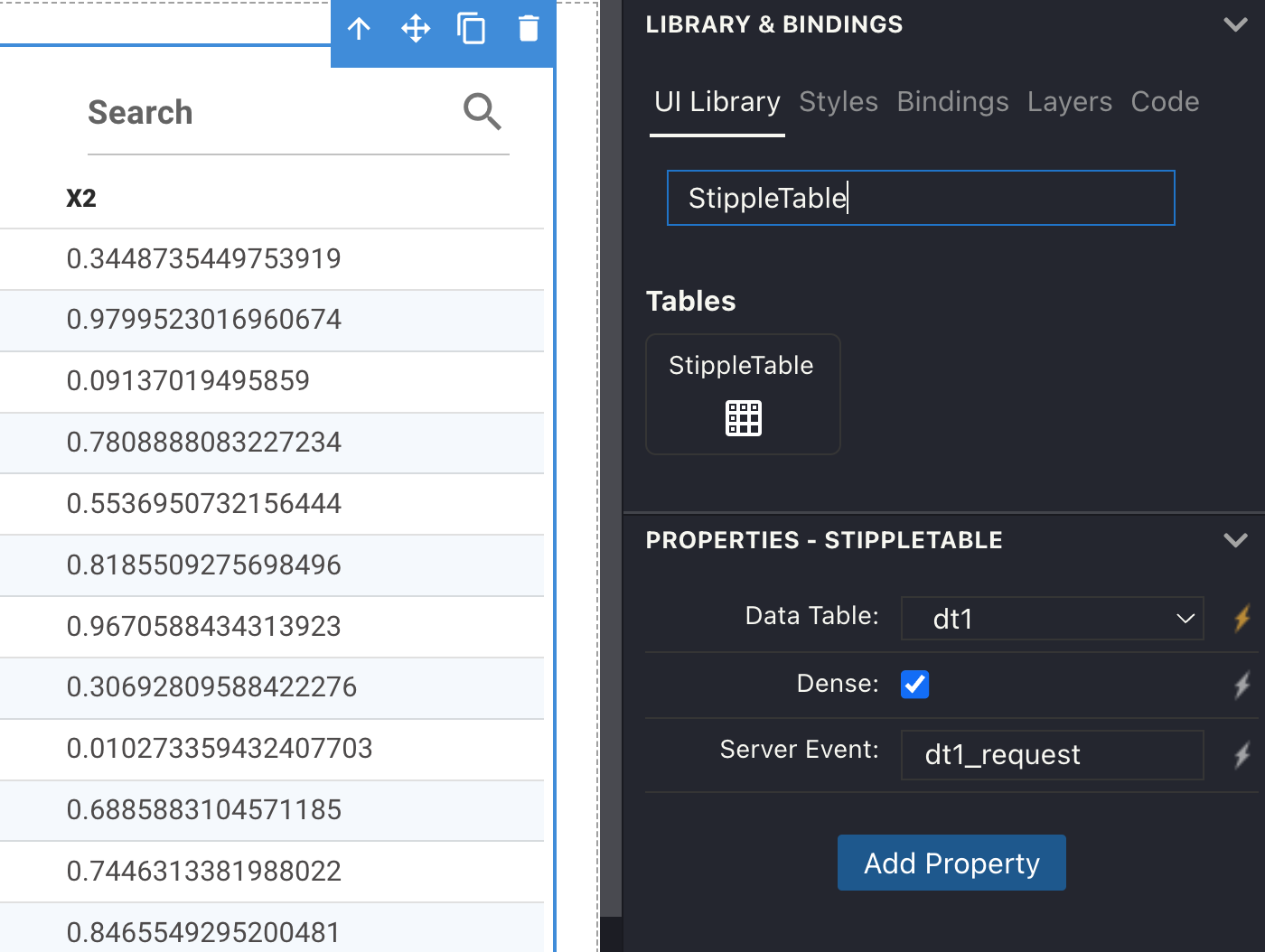
The required parameter for this component is a DataTable with the data to be displayed. Additionally and a name for the event handler that will be triggered when the user selects a new page in the table UI. You can use this to perform server-side pagination.
This is a complete example for the code in the backend:
module App

using GenieFramework, DataFrames
@genietools

StippleUI.Tables.set_default_rows_per_page(20)
StippleUI.Tables.set_max_rows_client_side(100)

const data = sort!(DataFrame(rand(1_000, 2), ["x1", "x2"]))::DataFrame

@app begin
  @out dt1 = DataTable(data; server_side = true)
end

@event dt1_request begin
  dt1 = @paginate(dt1, data)
  @push
end
"""

@page("/", ui)

end
Inside the @event block, the @paginate macro will pull new rows from the data DataFrame according to the pages selected in the UI. If you omit the server_side parameter and the handler, the pagination will be performed in the browser.
The set_max_rows_client_side sets the maximum number of rows that will be sent to the browser in order to avoid sending too much data at once.
Popup proxy
The popup proxy component opens a popup in a floating window when a component is clicked. The popup proxy can be added inside nestable components, and, like the other nestable components, anything can be dropped inside of it. To add a propup proxy, follow these steps:

1. Add a nestable component such as a button.
- Drill into it and add a popup proxy.
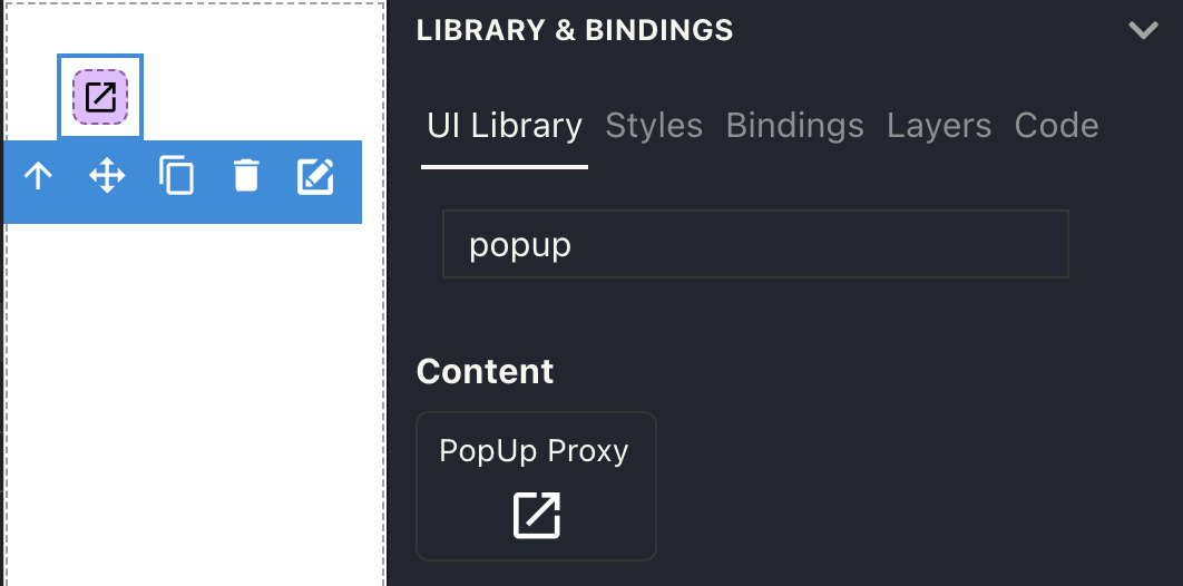
- Drill into the popup proxy and add the content you want to display in the popup.
When you go back to the main canvas, the button should display a popup proxy icon.

Bound chart
The bound chart lets you define the traces and layout in the Julia code, and bind them to the component in the visual editor. This is useful when a chart has a dynamic number of traces, or a complex layout.
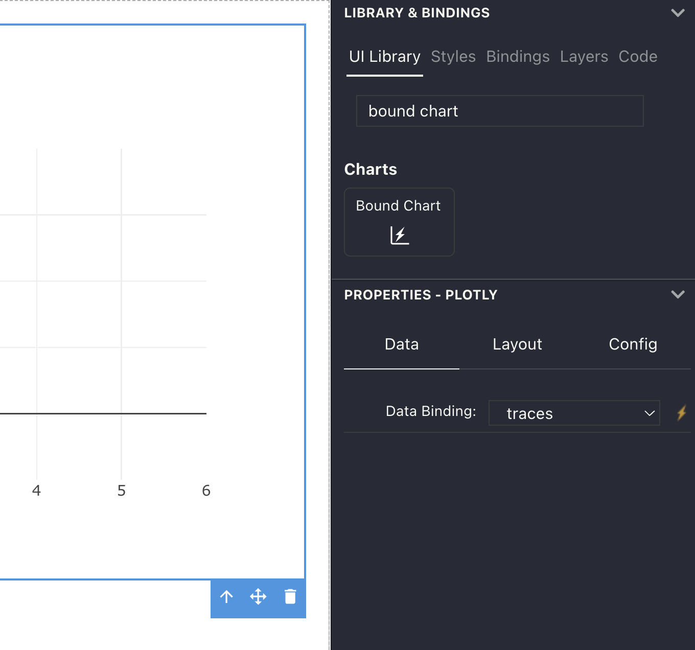
You'll need to use PlotlyBase to define the chart data as in this example:
using GenieFramework, PlotlyBase
@app begin
    @out traces = [scatter(x = randn(10), y = randn(10), mode = "markers")]
    @out layout = PlotlyBase.Layout(title="Hello World")
end