Exploring the German Credits Data
Data scientists don't usually start writing full-blown web apps from the get-go. Instead, we begin with the typical including data cleaning, exploratory analysis, testing of several models, etc., and only when we're confident in the quality of the insights extracted from the data do we start thinking about publicly sharing them with a web application. Genie Builder and Genie Framework come in very handy for this last step as it allows you to implement an interactive web UI so that:
- You can share your insights with just a link.
- Other people can re-run the analysis and fine-tune the insights through the controls in the UI.
All of this without writing a single line of HTML or Javascript thanks to Genie Builder's no-code editor.
In this tutorial, you'll learn to go from your existing Julia code to a Genie web app, take a look at the animation below to see what it looks like in a browser.
Writing the data analysis code
To illustrate the Genie workflow, we'll write some code to extract insights from the German Credit Risk dataset. This dataset contains information about 1000 people, where each person is described by 20 features such as age, sex or credit amount. Additionally, every person has been manually labelled as "good credit risk" or "bad credit risk" according to the feature values.
Say we want to extract the following insights from the dataset:
- Number and monetary amount in good and bad credits.
- Credit amounts and creditor ages.
- Number of credits by age range.
To calculate these metrics, save the code below to a script germancredits.jl and execute it in a Julia REPL to make sure everything is working.
using DataFrames, Dates, OrderedCollections

function good_bad_credits_stats(data::DataFrame)
    good_credits_count = data[data.Good_Rating .== true, [:Good_Rating]] |> nrow
    bad_credits_count = data[data.Good_Rating .== false, [:Good_Rating]] |> nrow
    good_credits_amount = data[data.Good_Rating .== true, [:Amount]] |> Array |> sum
    bad_credits_amount = data[data.Good_Rating .== false, [:Amount]] |> Array |> sum

    (; good_credits_count, bad_credits_count, good_credits_amount, bad_credits_amount)
end

function credit_age_amount(data::DataFrame; good_rating::Bool)
    data[data.Good_Rating .== good_rating, [:Age, :Amount]]
end

function credit_no_by_age(data::DataFrame; good_rating::Bool)
    age_stats::LittleDict{Int,Int} = LittleDict()
    for x in 20:10:90
      age_stats[x] = data[(data.Age .∈ [x:x+10]) .& (data.Good_Rating .== good_rating), [:Good_Rating]] |> nrow
    end
    age_stats
end

# testing the functions
using CSV
data = CSV.File("german_credits.csv") |> DataFrame
@show good_bad_credits_stats(data)
@show credit_age_amount(data, good_rating=true)
@show credit_no_by_age(data, good_rating=true)
Now that the analysis code is finished and working, it's time to make it into a Genie app.
New Genie app setup
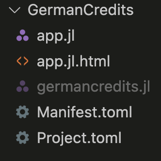
Launch Genie Builder and create a new app named "germancredits". In the workspace tab, you'll find that the newly-created app's code is split into two files: app.jl and app.jl.html. Of the two, app.jl is the one to be manually edited whereas app.jl.html is written to by the no-code editor. At this point, you can add the script germancredits.jl to the workspace to have all your files in one place.
To avoid conflicts, it is recommended to wrap the code in a module and remove any testing code. So, edit germancredits.jl to make it look like this:
 module GermanCredits
     export good_bad_credits_stats, credit_age_amount_duration, credit_data_by_age
     using DataFrames, Dates, OrderedCollections

     function good_bad_credits_stats(data::DataFrame)
         ...
     end
     function credit_age_amount(data::DataFrame; good_rating::Bool)
         ...
     end
     function credit_no_by_age(data::DataFrame; good_rating::Bool)
         ...
     end
 end
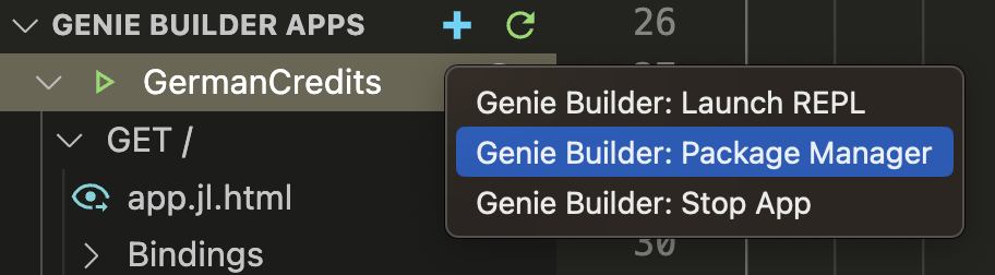
To install the required packages DataFrames, Dates and OrderedCollections within the app, launch the built-in package manager by right-clicking on the app's name on the left sidebar. You'll see the installation progress in the REPL, and the package versions will be added to the Project.toml file.
 Next, we'll design the UI to display the data insights.
Designing the UI in the no-code editor
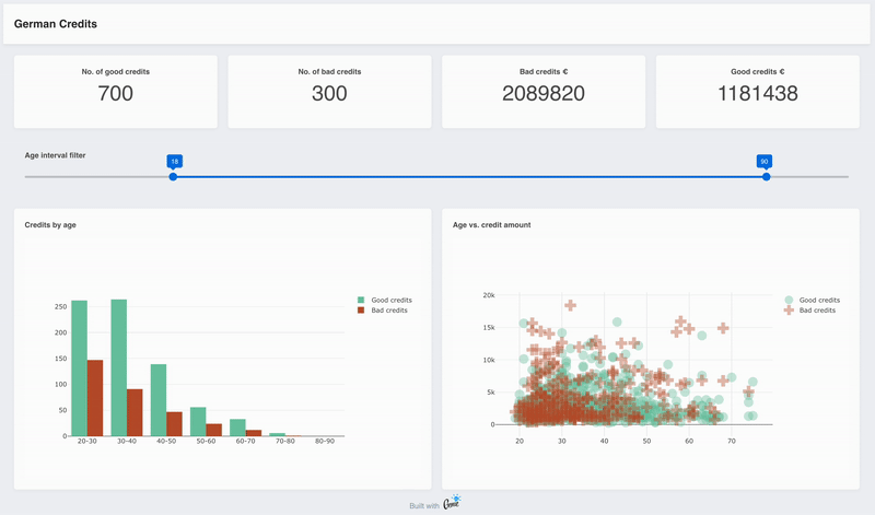
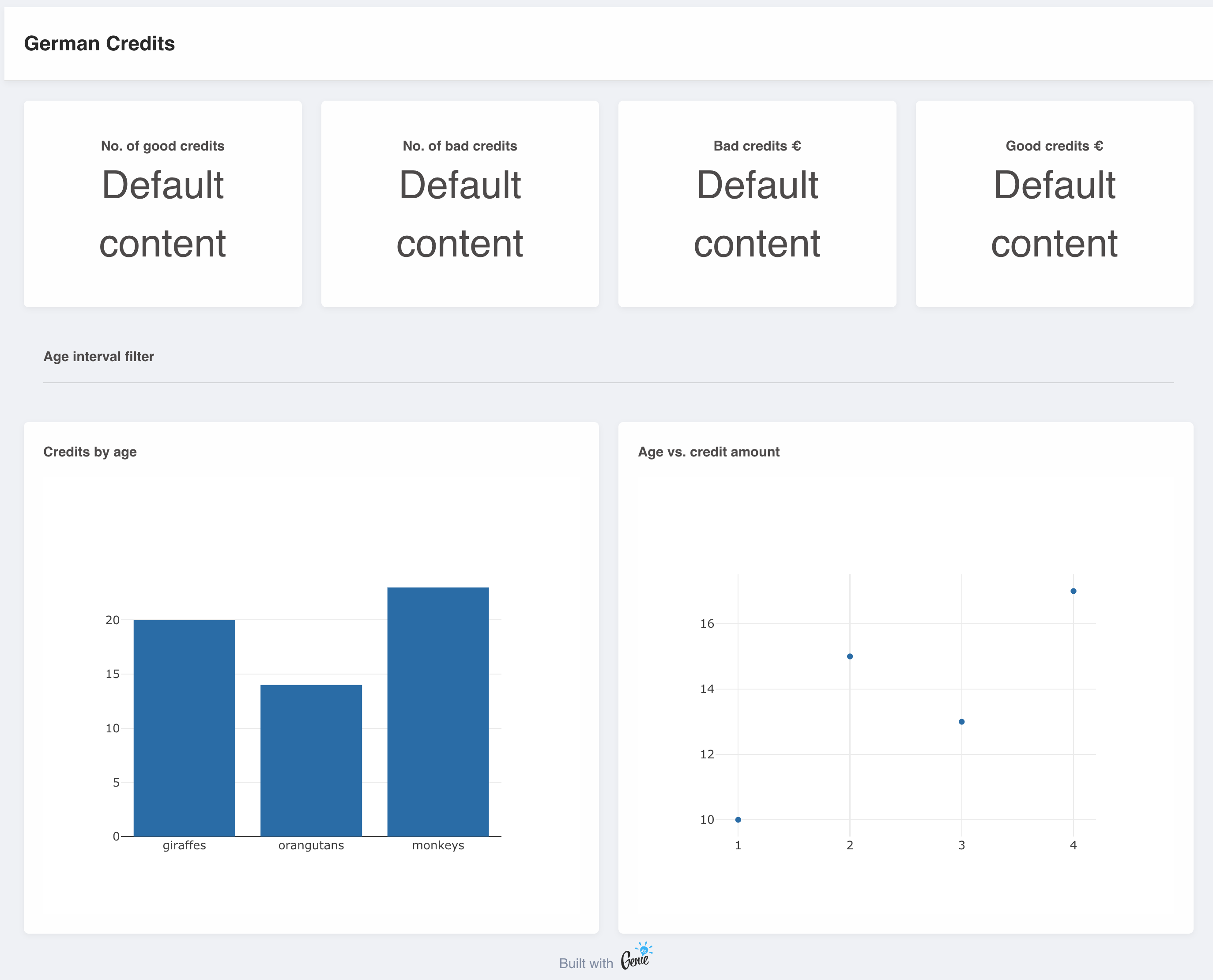
For the German Credits UI, we want to have:
- Page title header.
- Badges showing the number of credits and their monetary amount.
- A range control to filter the age of the people whose data is displayed.
- A bar chart displaying the number of credits by age.
- A scatter plot displaying age vs. amount for each credit.
To build the UI with the no-code editor, look for the components you need in the right sidebar and drag them onto the canvas. Start with the header, rows and columns to set the page layout:
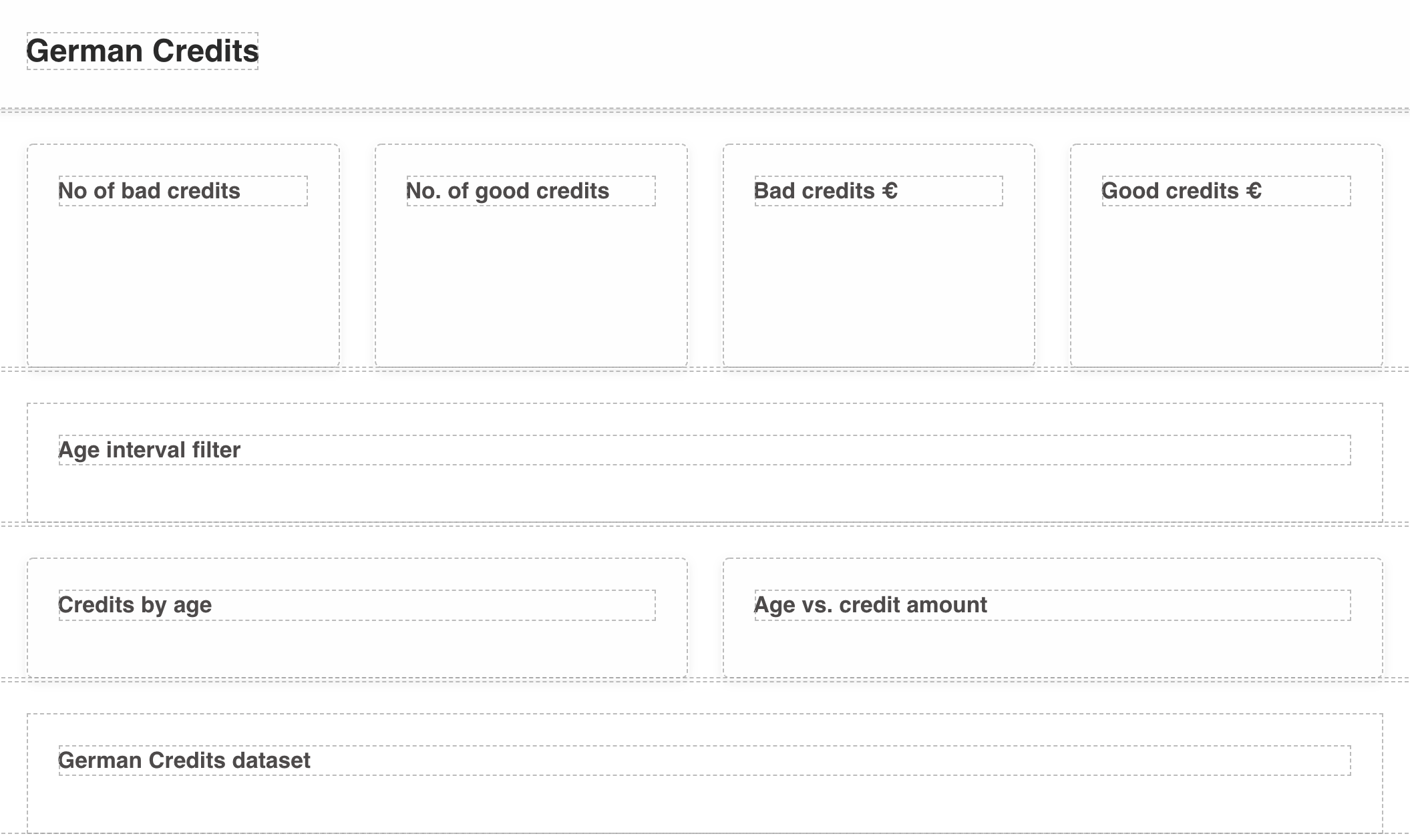
Next, add the following components:
- Paragraph (x4).
- Range.
- Bar.
- Scatter.
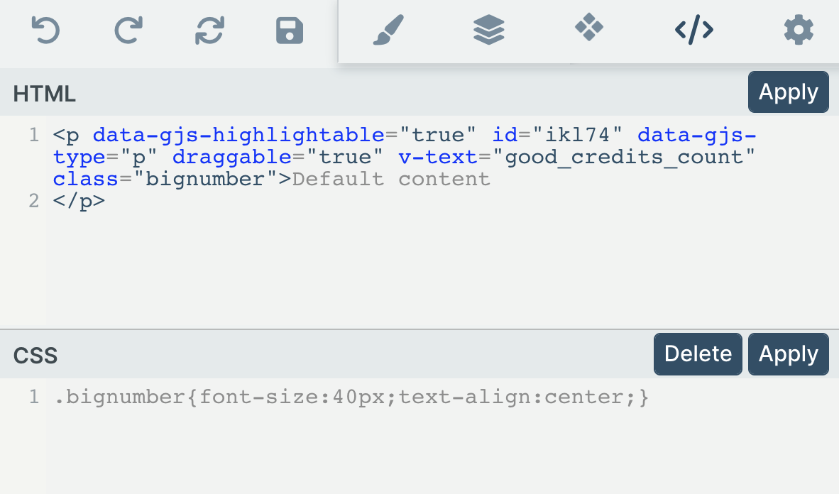
Finally, let's make the font of the number badges bigger. Click on the </> icon and change the class of the <p> element to bignumber. Then, add a new CSS style .bignumber{font-size:40px; text-align:center;}.
To preview the UI, click on the monitor icon next to the GET tab in the left sidebar. Note that nothing works yet, you still have to implement the app's logic and bind the UI components to the Julia code.
Implementing the app's logic
To make the app interactive you have to implement its logic by:
- Exposing reactive variables from the Julia code to the UI.
- Writing reactive code to handle user interaction.
- Binding the exposed variables to the UI components.
The file app.jl in the workspace is the main entry point to the app, and it's where you'll write the logic. This is what the file looks like by default:
 using GenieFramework
 @genietools

 @handlers begin
   @out message = "Hello World!"
   @onchange isready begin
     @show "App is loaded"
   end
 end

 @page("/", "app.jl.html")
To start with a clean app, delete the contents of the block delimited by the @handlers macro. Then, include the GermanCredits package and load the dataset by adding the following code before it:
 include("germancredits.jl")
 using .GermanCredits
 using GenieFramework, CSV, DataFrames, OrderedCollections

 const data = CSV.File("german_credits.csv") |> DataFrame
Next, we'll add the reactive variables and code for each element in the UI. Since we want to filter the data to show only a certain age range, let's start with the range selector.
Range selector
In Genie apps, reactivity is based around two concepts:
- Variables are exposed to the UI by tagging them with the
@inmacro if they take their value from the UI, or with the@outmacro if they output their value to the UI. - The code to handle interactions is written in the block delimited by the
@onchangemacro, which watches a variable and whenever it changes executes the code in the block.
To filter the data via the range selector in the UI, we need:
- A variable of type
RangeDatato store the range selected in the UI. - A
DataFrameto hold the filtered data. - A function call to update the available data when an age range is selected.
To implement these elements, add the following code inside the @handlers macro:
 @handlers begin
     @in age_range::RangeData{Int} = RangeData(18:90)
     @out filtered_data = DataFrame()
     @onchange age_range begin
         filtered_data = data[(age_range.range.start .<= data[!, :Age] .<= age_range.range.stop), :]
     end
 end
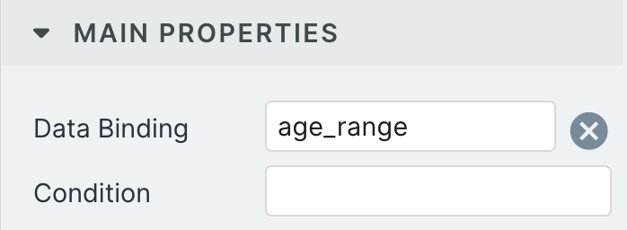
Note that the variables have default values so that the UI can be rendered when the page loads. Now, go to the no code editor, select the Range component and assign the age_range variable to its Data Binding field.
That's it for the range selector. Any time you move one end of the slider in the UI, the contents of filtered_data will be updated. Let's continue with the next element to show the updated insights.
Number badges
To display the number and amount in credits, you'll need:
- Variables to store the quantities.
- A call to
good_bad_credits_statsto update the variables when a new range is selected.
 @handlers begin
     ...
     @out good_credits_count = 0
     @out bad_credits_count = 0
     @out good_credits_amount = 0
     @out bad_credits_amount = 0
     @onchange age_range begin
         ...
         good_credits_count, bad_credits_count, good_credits_amount,
         bad_credits_amount = good_bad_credits_stats(filtered_data)
     end
 end
To show the number badges in the UI, assign each variable to the Text Binding field of a Paragraph component.
Number of credits by age plot
PlotData objects for plotting. The new recommended way is to directly use PlotlyJS traces as explained here.We'll plot the credits by age with a bar plot indexed by the age ranges in 10 year increments. For this, you'll need:
- An array to hold the x axis labels.
- An array of
PlotDatato hold the plot data. - A variable of type
PlotLayoutto specify the plot layout. - Reactive code to update the plots with the values calculated by
credit_no_by_age.
 @handlers begin
     ...
     @out age_slots = ["20-30", "30-40", "40-50", "50-60", "60-70", "70-80", "80-90"]
     @out credit_no_by_age_plot = PlotData[]
     @out credit_no_by_age_plot_layout = PlotLayout(barmode="group", showlegend = true)
     @onchange age_range begin
         ...
         credit_no_by_age_plot = [
             PlotData(
                 x = age_slots,
                 y = collect(values(credit_no_by_age(filtered_data; good_rating = true))),
                 name = "Good credits",
                 plot = StipplePlotly.Charts.PLOT_TYPE_BAR,
                 marker = PlotDataMarker(color = "#72C8A9")
             ),
             PlotData(
                 x = age_slots,
                 y = collect(values(credit_no_by_age(filtered_data; good_rating = false))),
                 name = "Bad credits",
                 plot = StipplePlotly.Charts.PLOT_TYPE_BAR,
                 marker = PlotDataMarker(color = "#BD5631")
             )
         ]
     end
 end
Age vs. credit amount scatter plot
For this plot, you'll require:
- An array of
PlotDatato hold the plot data. - A variable of type
PlotLayoutto specify the plot layout.
 @handlers begin
     ...
     @out age_amount_plot_layout = PlotLayout(showlegend = true)
     @out age_amount_plot = PlotData[]

     @onchangeany age_range begin
         ...
         dgood = credit_age_amount(filtered_data; good_rating = true)
         dbad = credit_age_amount(filtered_data; good_rating = false)
         age_amount_plot = [
             PlotData(
                 x = dgood.Age,
                 y = dgood.Amount,
                 name = "Good credits",
                 mode = "markers",
                 marker = PlotDataMarker(size=18, opacity= 0.4, color = "#72C8A9", symbol="circle")
             ),
             PlotData(
                 x = dbad.Age,
                 y = dbad.Amount,
                 name = "Bad credits",
                 mode = "markers",
                 marker = PlotDataMarker(size=18, opacity= 0.4, color = "#BD5631", symbol="cross")
             )
         ]
     end
 end
And with this last component, you've finished your Genie app! All is left to do is deploy it.